Planning your Instagram feed to be follower-worthy can be a tough task, especially if you don’t know where to begin. Having a cohesive, harmonious grid is essential to grabbing the audience’s attention. With one billion monthly active users on Instagram, taking time to find your brand’s tone, look and voice on your Instagram feed is more important than ever if you want to cut through all the competitive noise. So, how do you plan an Instagram feed that makes the user stop in their tracks and engage with your show-stopping content?
Let’s get you clued up on the best way to create your brand’s look and style on your business Instagram feed.
First up, consistency is key. The overall look and feel of your grid should remain unchanged. Spend a couple of hours researching and conceptualising your feed to create an unclouded vision about the overall aesthetic.

Here are some tips to get you started:
Someone who clicks on your profile is going to see a grid of nine images and not just one. So, it needs to make sense together. Think about exactly what you want your grid to look like to make it magical for the viewer. Consider your content pillars and the kind of content you want to create as a foundation and go from there.
Let’s run you through our top-10 grid examples to get you inspired.
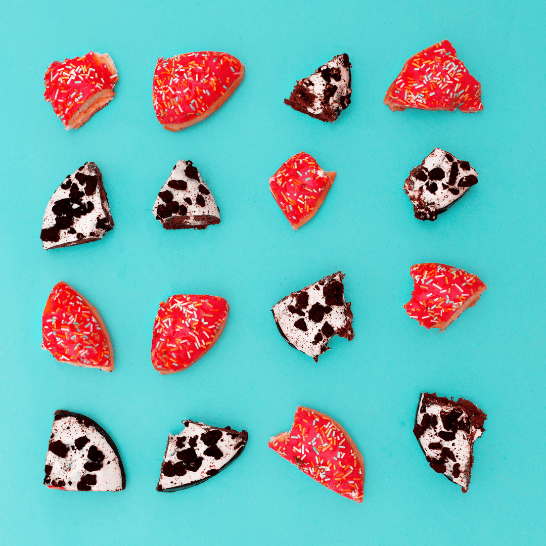
This is the most used grid layout, as it is the easiest and requires the least amount of effort. Square feeds stick to the same filter or colour palette to create a cohesive look and feel.

This layout uses every image as a checkerboard often alternating between a picture and something else like a quote, infographic, or icon. Every second image is another colour or theme and once a few images are posted it starts to resemble a checkerboard.

This grid example is used by many profiles on Instagram as it makes your feed look consistent almost instantly. The theme occurs diagonally on the grid and the images will be the same or similar in subject.

Working in a line of 3 images is a highly effective method because it is easy for the viewer to read. This Instagram layout lets you be creative and tells a story with a row of images. Naturally, our eyes read from left to right, making the audience linger on your feed for longer.

Planning your feed in horizontal lines is a favourable approach taken by many Instagram accounts. It’s easy to maintain, eye-catching and encourages the user to keep scrolling down your profile. The lines can be on the left, centre or right-hand column and can consist of anything from drawings, graphics, icons, or quotes. It’s all about having a single consistent line that draws the eye horizontally.

These work especially well for product photography and with the new Instagram shopping feature the viewer can purchase your products straight from the platform. You can design your ‘flat-lays’ on your grid according to colours, catalogues, product launches, seasonal themes, or holidays.

The mosaic tile layout is used to crop one picture into separate images to create an overall image. The only downfall of using this layout is that it can be confusing for the audience when they see a single cropped image in their personal feed.

Rainbow grids work in sets of around 9 – 12 images that are all the same colour until you transition to the next. This layout makes your grid stand out and the idea is to make it look like the colours of the rainbow.

This layout uses a border around the image to differentiate the images. Your borders don’t have to be square either. You can experiment with different shapes to make the grid stand out.

Say hello to the hardest, but most effective, layout to plan for your Instagram feed. This layout is exactly how it sounds. Your images are split into a variety of grids and when all the posts come together it makes up your final image, the puzzle. It is different to mosaic tiles as it’s not a single image split symmetrically but rather a variety of images that overlap each other.

Remember, these are just our top examples, and we encourage you to play around to see which one suits your brand. Don’t be afraid to mix and match either. Combine some puzzle pieces with a checkerboard and let your feed be engagement worthy.
You’ve created a brand message in your marketing strategy so make sure you stick to it and don’t navigate too far away. Content batching is an effective way to ensure that you have your curated copy and content planned. This avoids having to scramble for a post at the last minute and deviating from your brand message.
You’ve conceptualised your vision, chosen your grid and fine-tuned your brand messaging. What’s next? Creating a theme and choosing an aesthetic. Keep in mind that how your brand is seen on social media must correspond with your website.
Here’s how to create a theme and aesthetic that screams your brand.

Here are some tips on how to use colour effectively in your feed:
All of these play a big part in your grid aesthetic to command the attention of your audience. Spend some time fine-tuning these and you’ll be on your way to growing your audience, increasing engagement, and generating leads.
One of the worst mistakes any brand can make when planning their Instagram feed is to use inferior quality images. Pixelated, blurry images shriek unprofessionalism and your audience won’t bother hanging around.

You don’t need a fancy camera either to take high-quality images when your smartphone works perfectly, too. So, grab your phone, play around with the subject matter, and make sure your images are engaging and something the audience wants to see.
We’ve said it before, and we’ll say it again. Consistency. Is. Key. Posting consistently lets your followers know when they should expect to hear from you which increases engagement on your profile and has a positive influence on your algorithms.
So, how do you make sure you post consistent, superior content? Content planning and batching like a pro.

Now that you’re up to speed on how to plan your Instagram feed, it’s time to fill you in on a little secret: Instagram planning apps!
These apps allow you to visually plan, organise, and schedule your feed ahead of time. It saves you time, energy, and stress to make sure your feed is the cream of the crop. Once you hit that schedule button you can sit back, relax, and watch the engagement light up.
Here are our top 3 Instagram planning apps and why we love them:


We hope you’ve enjoyed reading our blog on the best ways to plan your Instagram feed. If you follow these tips, we have no doubt your brand will start to establish its own style on the platform. And don’t forget to have fun with it too!
Creating a cohesive brand tone, look and voice on your feed can help increase engagement, grow your following, build brand awareness, and generate leads to your website.
Did you find this blog helpful? Share it on social media to help other business owners.