- Free Lunch & Learn: Build high-quality teams with remote talent
- Next Session: 18 March | 12pm
- Free Lunch & Learn: 18 March | 12pm
There are millions of e-commerce businesses out there and that means you’re always competing to stand out. You might be looking at digital marketing channels, such as social media, to increase conversions. Rarely do businesses focus on the core of their marketing – the all-important website. E-commerce conversion optimisation is critical and can have a direct impact on the success of your business. What entrepreneur doesn’t want success?
So, to increase conversions on your e-commerce website, be sure to follow these 8 quick tips.
To begin, let’s get you familiar with some of the terms.
When a user completes a desired action from your CTA (call to action), this is called a conversion. A conversion can take many forms and a few of them include:
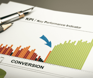
The conversion rate is how many conversions you get from the desired action divided by the total number of visitors within a certain period. According to a study by VWO.com, best performing websites usually display a conversion rate of 11% and more.

Now that you know what a conversion rate is, how do you optimise it for your website? Let’s run through our quick ways to boost your e-commerce conversion rates.
Before you go any further, make sure that you are monitoring your conversion rate with Google Analytics to keep your finger on the pulse of how well your website is performing. Tracking these metrics lets you see the areas that may need attention, or a new strategy implemented so you know which e-commerce conversion optimisation tips to follow.

Listen closely: the average time a user spends on a site is 45 seconds. That means you have less than a minute to convince someone to stay on your site. Put your website’s heart on its sleeve by making it so simple and attractive for the audience, that they don’t even think twice about converting!
Here are the top ways to improve usability:
Don’t let that user leave their future treasures in an abandoned cart. Enable pop-ups that catch their eye with “limited deals”, “last chance” or discount codes. You can install plugins that allow you to display pop-ups as the user is about to leave your site, enticing them to return to what they almost left behind.

Some suggested abandoned cart plugins to install include:
Almost 70% of customers abandon their online shopping cart. That’s a lot of profit margin to be lost with such a simple solution being offered! With an abandoned cart recovery plugin, your customers will receive abandoned cart emails to help them recover their purchase. According to MooSend, 10,7% of customers completed their purchase after receiving an abandoned cart email.
Nobody shops on an untrustworthy e-commerce site. By adding social proof to your website, you can promote trust in your brand. Social proof is when you give some information or evidence about your offering that verifies your authenticity as a brand. This lets the audience know that other people are using your products which builds trust and brand loyalty. Once trust is formed, the audience is influenced to act and convert as there has been a positive impact on their buying decision. The more social proof the better, we say!

Some examples of social proof are:
Websites with social proof have much higher conversion rates than those that don’t. In fact, 97% of customers say that online reviews affect their buying decision.
Human beings feel more pressure to buy something when there is a sense of urgency attached to it. Add a countdown timer template to your website that advertises an exclusive offer or discount to encourage the user to convert.

Leave them with the idea that if they don’t act fast, they will be regretting it later. Make sure the countdown timers are visible on all landing pages and are placed in an obvious position. The use of bold colours in your countdown timer easily captures attention and can save the user wanting to leave your site.
Many times, users navigate away from your site because they can’t find the answers they are looking for. Visitors to your site could be dropping off because they may be confused about the smallest thing. Cut the confusion and offer live chats so that any queries can be answered quickly and efficiently.
Live customer support offers real-time help for customers who are already in the consideration phase and just need a gentle nudge in the right direction. The turnaround time for getting an answer is short and it builds trust with the audience as they can have a personal conversation with someone within the company.
LiveChat and ChatBot are great live customer support plugins to use for your e-commerce conversion optimisation. Remember, trust equals conversions!
We’ve spoken about how personalisation works in email marketing so why think otherwise when it comes to your website?
Personalisation tools like Google Optimise let you create a personalised, engaging experience for your customer whether it’s a friendly pop-up a tailored message at check-out.
The user has come this far – your job is to make crossing the finish line as easy and pleasant as possible! Make sure your checkout process is clear, fast, straightforward, and doesn’t leave the audience scratching their head. Once they’ve come to checkout, make sure the steps are so easy that they have no trouble parting with their hard-earned cash.

Some of our tips for a user-friendly checkout are:
Make sure your checkout forms are clear and avoid any unnecessary noise. Only ask for the bare minimum information from the customer that is needed for them to complete their purchase. This lets the user fill out their details quickly and without being annoyed and overwhelmed.
We’re about to drop a truth bomb. Not everyone wants to be a part of your mailing list. Don’t force the customer to sign up before completing their purchase.
Give them the choice of sign up as a guest without forcing newsletter subscription upon them. Customers don’t feel comfortable sharing their personal information nor do they want to go through the hassle of having an account on every website they buy from.
Add progress bars on the checkout process to let the consumer know exactly how much longer it will take to complete their purchase. This creates transparency for the user and will most likely encourage them to stick around if they see they are at the final hurdle.
There is nothing more frustrating for a customer than finding something you adore online, only to be slapped with a shipping charge that is more than the item itself. Try offering free shipping to convince the potential buyer to buy your product or service over your competitor.
We understand that not all small business can afford to cut their shipping costs in the cost price of their product. Our advice? Offer free shipping to customers when they spend over a certain amount. This gives the buyer the choice and encourages them to spend more on your site altogether.

Once in the payment stage, lock in the conversion with security badges that let the user know their transaction is safe. This helps your e-commerce business website gain credibility and there is more chance of a repeat purchase in future.
That’s it! We hope you enjoyed this list of 8 quick ways to improve your e-commerce conversion rate. We hope you feel inspired to get your e-commerce site fully optimised for more conversions! Each week we share our top tips for attracting new customers, growing your online presence, and converting your audience.
If you enjoyed this blog, have a peek at the rest of them, here.
Join our free 40-minute Lunch & Learn on how UK businesses are building high-performing remote teams in South Africa.
Host: James Townsend-Rose, CEO of Outsourcery and Seamless
Practical advice. Real examples. Live Q&A.