- Free Lunch & Learn: Build a better team without the trade-offs
- Next Session: 16 April | 1pm
- Free Lunch & Learn: 18 March | 12pm
You might not think that a user’s experience of your website has much to do with conversions, but the truth is quite the opposite. User experience (UX) has everything to do with conversions. With the festive season fast approaching, now is the best time to consider how you can improve user experience on your website to optimise for conversions. The Christmas holidays are generally when people spend a lot of money. In fact, in a recent survey, 60% of consumers started their Christmas shopping before December 2020. There has also been a 64% increase in online spending by holiday shoppers compared to the previous festive season. So, it’s best to be prepared.
To improve user experience and optimise your website for conversions ahead of the holidays, you can apply a variety of methodologies. Some are as simple as altering the predominant font on your website, and some are more complicated like improving your website speed. However, no matter which of the below techniques you choose to incorporate to improve user experience on your website, they’re all effective ways to drive conversions.

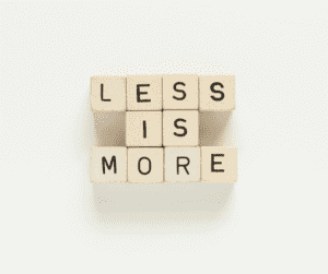
Sometimes marketers tend to go a bit moggy when it comes to the websites that they are responsible for. From packing the site full of content and creating lengthy forms for users to fill in, to adding as many buttons as possible so that user has more options, us marketers are known for wanting to wad as much we can into a website.
However, too much content can be quite overwhelming to a user and generally, the audience visiting your website has limited time and a limited attention span. So, in general, every additional element you incorporate on your website lowers your conversion rates.
Users will drop off quite quickly if there’s a lot going on and a myriad of choices to make. A Columbia University study found that when an online store reduced product options from 24 to 6, sales increased by 600%.
To improve user experience, try to cut the fluff wherever you can and nurture the user’s journey towards conversions.

In a recent study, it was found that it takes less than 0,1 seconds to form a first impression about a person. When it comes to the user’s experience of a website, this amount is slashed to 0,05 seconds. How long users stay on your site and how likely they are to convert depends largely on the first moments of their experience on your website.
Factors such as speed, structure, colours, spacing, scrolling, symmetry, and the amount of text all make an impact on whether they’re going to stay on your website past those 50 milliseconds.

A sure-fire way to grab a user’s attention in those first few milliseconds (and keep them on your website until they convert) is to improve the use of visual cues on your website. Take your above the fold area for example, according to Chartbeat, 66% of the attention on a normal site is spent below the fold. People tend to scroll right past the leader board at the top of the page.
Another powerful way to improve user experience on your website is to include animation in your design. This is a clever way to not only show potential customers your business or brand but to keep them interested in what you have to offer.

Like with any mode of marketing, making sure your calls to action (CTAs) are compelling is imperative to your strategy. Making sure your CTAs are immediately visible to users on your website is just as important. Yes, we know this is a controversial thing to say. Many website designers prefer more unobtrusive, subtle CTAs. But without a clear CTA, it’s unrealistic to expect users to convert.
Essentially, you want to hit the sweet spot between aggressive and hardly visible CTAs to improve user experience on your site. This will drive conversions as users can easily spot what it is you have to offer without being bombarded with hard selling.

The speed of your website makes a massive difference to the way a user experiences your brand. According to Neil Patel, 40% of users abandon a website that takes anything more than three seconds to load. Furthering this point, Amazon has calculated that a page slowdown of just one second could cost them billions of sales each year. We feel like this is enough proof that site speed is an important part of a user’s experience.
You can improve site speed by using CSS icon fonts in place of images and using text instead of videos or images above the fold.
Although your website is a crucial component in your marketing toolbox, it is important to remember that, once a user reaches your website, your marketing efforts have already won. Now, it’s time to start selling to that user and driving conversions by nailing their experience of your website. You can do this through having clear CTAs, clever use of visual cues, improving site speed, and considering first impressions.
Of course, if you feel that improving user experience when it comes to your website falls outside of your skillset, you can always hire a virtual web optimisation expert from only £17.50 per hour. Our web optimisation team can conduct a full user experience audit for you and use various web design and development methods to improve user experience and get your website optimised for conversions this festive season.
Join James Townsend-Rose for a free, straight-talking session on building a better team without the trade-offs.
When: Thursday, 16 April at 1pm
Host: James Townsend-Rose, CEO of Outsourcery
No fluff. Honest insight. Real examples. Live Q&A.